On MSNBC’s Morning Joe today, Steven Rattner detailed three different proposals for additional stimulus checks, including one from 10 GOP senators, and discussed why new checks should target those who need them—not wealthier Americans, who history has shown will save them.
At the center of the wrangling over the next rescue/stimulus package is the question of more direct payments to individuals, like the $1,200 checks from last spring and the $600 checks just a month ago. Who should receive these payments? What has happened to the payments made thus far? And do we even need more of this kind of help from Washington?
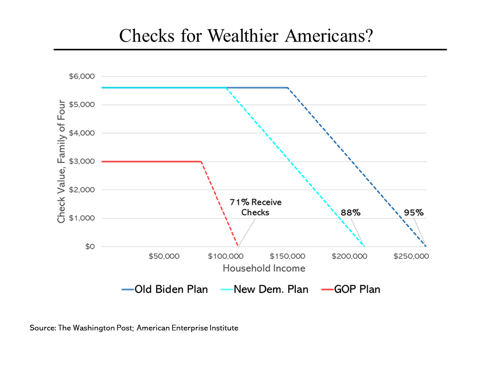 Three proposals are now on the table: one from the Biden administration, one from a group of 10 less conservative Republicans and an alternative somewhere in between that Democrats are now socializing. What is remarkable about all three proposals is how many Americans would receive cash. Not surprisingly, the most generous is the White House plan, which would send the full $5,600 to every family ($1,400 each for two parents and two children) earning up to $150,000. From there, the amounts would phase down but even families with incomes up to $262,000 would receive something. That amounts to 95% of all households.
At the other end, the Republican counterproposal would halt payments at $110,000 per family (as well as lower the maximum amount) to $750 per person. While that would cut the more than $400 billion cost of the Biden plan in half, 71% of Americans would still receive at least a partial amount. The new Democratic alternative preserves the $1,400 maximum (a figure that President Biden has been adamant about) but lowers the cutoff to $212,000 per family (88% coverage).
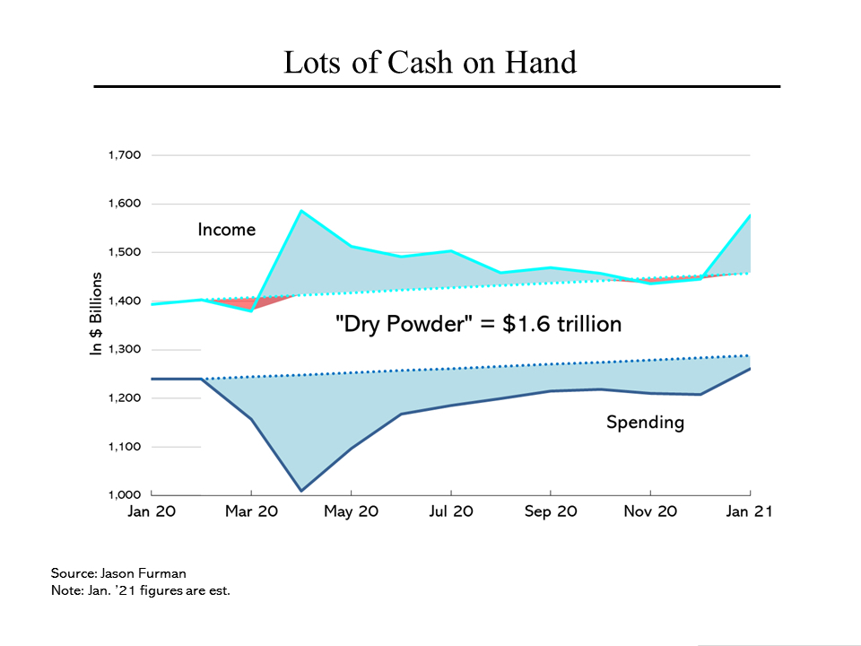 Meanwhile, the financial position of Americans is far better than is commonly understood. The two straight dotted lines on this chart show the long-term trend in personal income and spending. Because the income side of the equation includes government payments (not just stimulus checks but all other transfers from Washington that reach individuals, like unemployment insurance) total income has actually gone up, by about 13% since last January. (The impact of the stimulus checks can be seen clearly in the upward spikes.)
On the other side of the ledger, largely because of the lockdowns, Americans have been spending far less. Even now, outlays are running below long-term trends. Combining the two amounts totals around $1.6 trillion (yes, trillion) of “dry powder” on the sidelines. Economists expect a burst of spending when public health conditions permit.
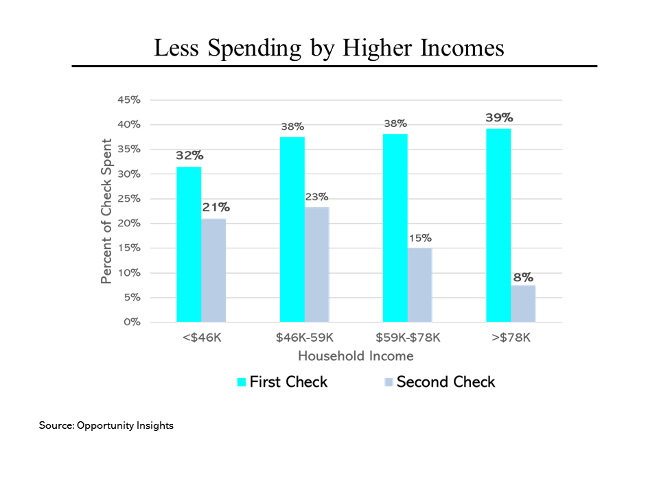 Another issue about the stimulus checks is how much of them get spent. (As the previous chart suggests, not much.) The lighter blue shows, by income level, what happened to the first round of checks. Regardless of income, less than 40% was spent. The balance went either into savings or toward debt reduction (which is essentially the same as saving). Even more shocking is what appears to have happened to last December’s $600 payments; the portion spent dropped across the board and for those households with more than $78,000 a year of income, less than 10% has been spent.