Banks were a big part of Thursday night’s Democratic debate, as they were at last week’s debate. While Bernie Sanders (and Elizabeth Warren) want the big banks broken up, the justification for that move is at best murky. Below are some charts that counter the passionate but flawed rhetoric against our biggest banks. For the related video clip, click here.
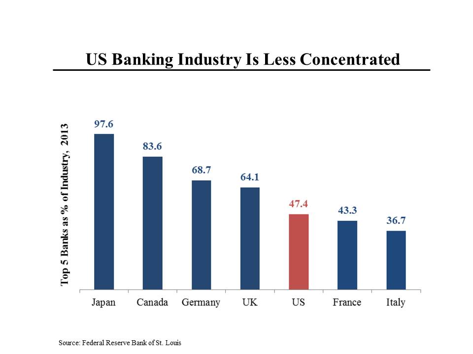
Sanders and Warren say repeatedly that the American financial system is controlled by five large banks. As this chart shows, the five biggest American banks control a smaller share of the industry than in many other developed economies. Moreover, banking in the United States is less concentrated than many other industries — for example, four wireless carriers control virtually all of the cell phone business in the US. The five largest car manufacturers have a larger share of the US market than the five largest banks. Etc.
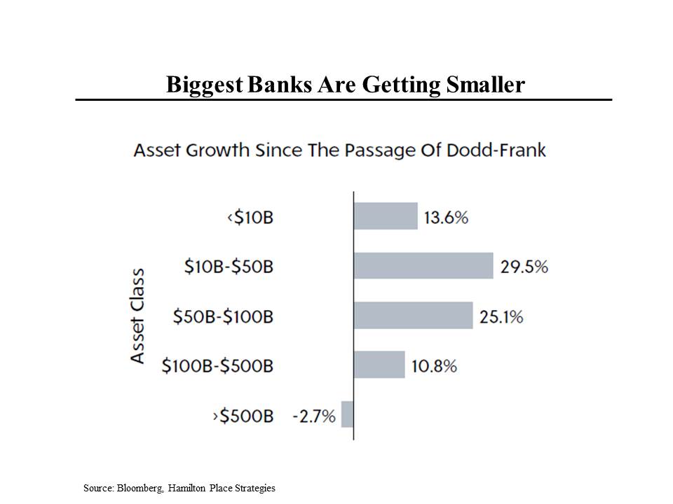
Another false contention is that the biggest banks are getting bigger and bigger. While it’s true that the large banks increased their size around the time of the financial crisis by buying weaker, failing institutions, since the passage of the Dodd-Frank financial reform legislation, the largest banks have, in fact, gotten smaller, while banks with less than $500 billion of assets have gotten larger. That’s in part because these ultra-large institutions are subject to special regulatory requirements that have made their business less profitable.
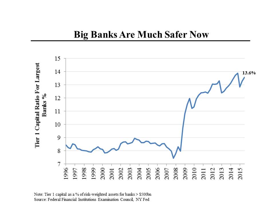
Finally, the notion that our banking system is as susceptible to another crisis as it was in 2008 is also suspect. Since the passage of Dodd-Frank and the imposition of enhanced regulations, banks have increased their capital bases and thereby reduced their risk. In this chart, the higher the line goes, the safer the bank is. It’s easy to see how precarious the banking system was at the end of 2007, when the ratio dropped to a low of 7.4%. But now, the capital ratio is almost exactly double what it was at the nadir.
